premium product branding
JOK Premium Pipes: Strategic Repositioning for a Handcrafted Stainless, Paperless Smoking Tool.
How a patented Italian smoking tool moved from low-ticket retail positioning to a coherent design‑driven brand with room for sustainable pricing and growth.
overview
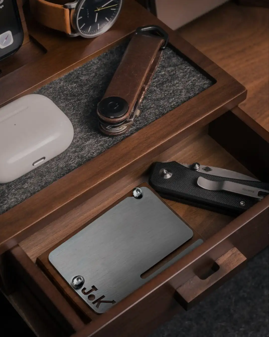
JOK is a stainless, reusable, paperless smoking tool designed and produced by a young Italian couple who built their own workshop, tested the product in real use and patented the solution. When they contacted WØM, most of their effort had gone into engineering and production; the commercial side relied on a basic website and a presence in tobacco shops with entry‑level pricing. The project focused on aligning the product’s real value with its positioning: clarifying the promise, restructuring the offer and building a digital identity consistent with a design object, not a commodity.CLIENT BRIEF
The founders asked for help “to promote the product better online” and increase sales. They were aware that the current site and communication did not reflect the amount of work behind JOK but framed the problem mainly as a matter of visibility and advertising. Distribution was oriented to impulse purchases and low price points, without a clear separation between different configurations of the product or between everyday buyers and customers looking for a long‑lasting object.CHALLENGE
The real challenge was to move JOK out of the “accessory” box and into a space where its specific strengths—stainless construction, paperless use, reduced waste and smell, Italian manufacturing—could justify a different conversation with retailers and end customers. The existing website treated the product like any small item in a catalogue: list, price, cart. There was little explanation of why the tool exists, how it changes the smoking routine, and what makes it different from disposable alternatives. Without this, it was difficult to support higher margins, enter design‑oriented stores or speak to a more demanding audience.
SOLUTION
Clarifying the value proposition
WØM worked with the founders to define a simple, business‑oriented promise: a durable, stainless, paperless tool that makes the smoking routine cleaner, more controlled and less wasteful. This clarity became the backbone of the new site structure and of future conversations with retailers: not “a new gadget”, but a way to upgrade an existing habit.
Repositioning through structure and language
The website was rebuilt around a few key questions that entrepreneurs and shoppers actually ask: what is it, who is it for, how is it made, why does it cost more than a disposable option. Visuals, copy and navigation were aligned to show JOK as a compact piece of product design, with emphasis on manufacturing steps, materials, and day‑to‑day use, rather than on slogans.
Organising the offer for different buyers
The previous catalogue did not clearly separate basic kits, complete sets and more refined finishes. The new architecture groups products by use and type of buyer (first‑time customer, gift purchase, enthusiast), helping both online visitors and potential resellers understand which version fits their context. This makes pricing easier to justify and simplifies discussions with shops that need clear margins and explanations.
Building a small but solid brand base
Beyond the shop, the site now includes a clear origin story, a section on maintenance and durability, and room for future content on waste reduction and new rituals. The platform is designed to support negotiations with distributors and design‑driven stores and to grow in a consistent direction over the next years.