• building
  • beautiful
  • bridges
  • building
  • beautiful
Please Wait

BuildingBeautifulBridges

ITALY SINGAPORE
MIAMI GREECE

we don’t just create campaigns— We dissect what makes you unique.


O Phono: The Signal of Authentic Communication

At WOM, we don't just speak; we transmit. O Phono represents our commitment to clarity and authenticity. Borrowing from the radio call signal 'Ø,' used by those who seek connections across borders, we too bridge the gap between ideas and people.

Today's Briefing

From Soft Wellness to Brand System
How High-End Wellness Clinics Can Align Brand Aesthetics with Patient Experience
From Soft Wellness to Brand System
Intro

From Roman thermae to 19th-century hydrotherapy sanatoriums, wellness spaces have always mirrored the cultural values of their time. In Ancient Greece, kalokagathia, the harmony of beauty and goodness, was both an ethical principle and a design framework. In the 1800s, European clinics in Baden-Baden and Vichy blended marble aesthetics with strict regimens to suggest both luxury and discipline. The message was clear: order and health go hand in hand.

Fast-forward to the late 20th century, and the clinical template becomes uniform: white coats, sterile typography, glossy branding, and a language of authority. Between 1995 and 2010, especially in Europe and Southeast Asia, wellness design borrowed heavily from pharmaceutical visual culture. Fonts were neutral, surfaces were reflective, and messaging was concise, often cold.

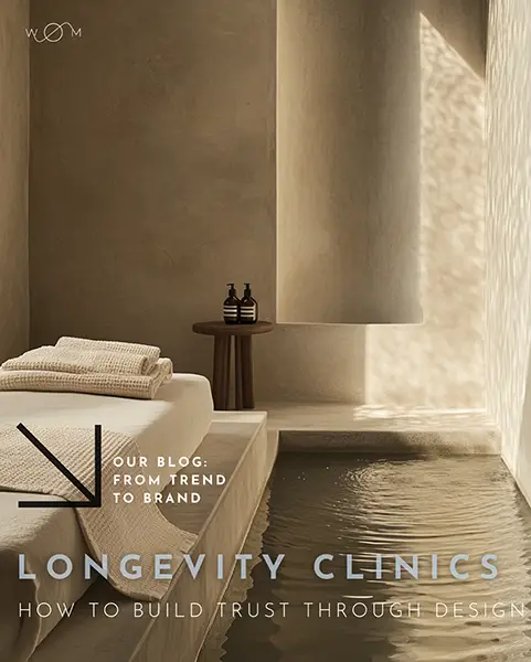
But post-2020, a quiet revolution emerged. No longer was trust synonymous with distance. Softness, visual and verbal, became a new form of credibility. Clinics adopted clay tones, uncoated papers, serif typography, and slower UX flows. Websites spoke in a whisper. Visual warmth replaced sterile precision.

Yet behind that softness, the structure often stayed rigid, or worse, fractured.

From the mid-1990s through the 2010s, wellness branding followed a clinical pattern: white lab coats, glossy surfaces, minimalist sans-serif. Aesthetic authority was the shorthand for safety. The message was loud, controlled, and sterile, especially in Europe and Southeast Asia.

After 2020, that paradigm shifted. Global disruptions reoriented patients’ expectations. Aesthetic clinics, spas, and wellness startups began adopting visual softness: clay tones, uncoated paper stocks, serif typography, and slowed-down digital flows.

But what looked like a cultural evolution often revealed a structural gap.

3 recurring problems we’ve encountered across over 40 clinics and wellness startups

-Surface over system A soft Instagram feed hiding a rushed, unpersonalized booking journey.
-Muted identity, loud friction. Gentle tone-of-voice online, aggressive reminder emails offline.
-Visual calm, backend chaos. Slowness in design, speed (and confusion) in operations.

These inconsistencies don't go unnoticed, especially by high-net-worth patients. As expectations have risen, so has their fluency in identifying brands that align intent with execution.


Three failures we frequently observe (and what to do instead):

Failure: Aesthetic signals without service alignment
Clinics adopt softness visually, but workflows remain medicalized and abrupt.
Instead, map your visual tone to each stage of the patient experience from calendar UX to email copy.

Failure: Underdefined tone-of-voice"Calm" becomes an excuse for vague language. 
Instead, define what kind of calm, minimalist? empathetic? detached?—and create scripts accordingly.

Failure: No operational narrative. The visual identity is documented, but the backend experience feels improvised.
Instead, design support flows and decision trees as brand artifacts, not as admin.

From "Clean Girl" to Brand Logic

How to avoid building a trend-shaped brand that breaks in 12 months

The "clean girl" aesthetic, a TikTok-native look defined by fresh skin, neutral tones, and soft understatement, quickly colonized the beauty and wellness space. What began as a cultural shorthand for minimal effort turned into a visual monoculture: lowercase serif logos, beige packaging, generically positive taglines.

The problem? Many founder-led brands fell into a familiar trap: the aesthetic scaled, but the logic didn’t.

In our review of over 60 clean-aligned beauty startups, we’ve documented key weaknesses:

-Visual UI coherence but navigational vagueness
-Naming that sounds light, but lacks differentiation or phonetic grip
-Support that mirrors the tone but not the clarity of the brand promise

How high-clarity brands stand apart (even within the same trend):

-They structure the voice before designing the look. If the tone is soft, what vocabulary does it reject? What rhythms does it follow?
-They embed clean logic into every decision tree. Minimal friction doesn’t mean fewer clicks; it means fewer doubts.
-They translate visual softness into operational credibility. Even your refund policy communicates your positioning.

wom services srls via p. gobetti, 9 37138 verona - italy p.iva it04567240231