fashion marketing campaign
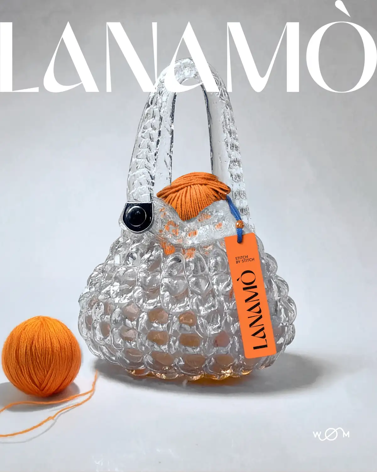
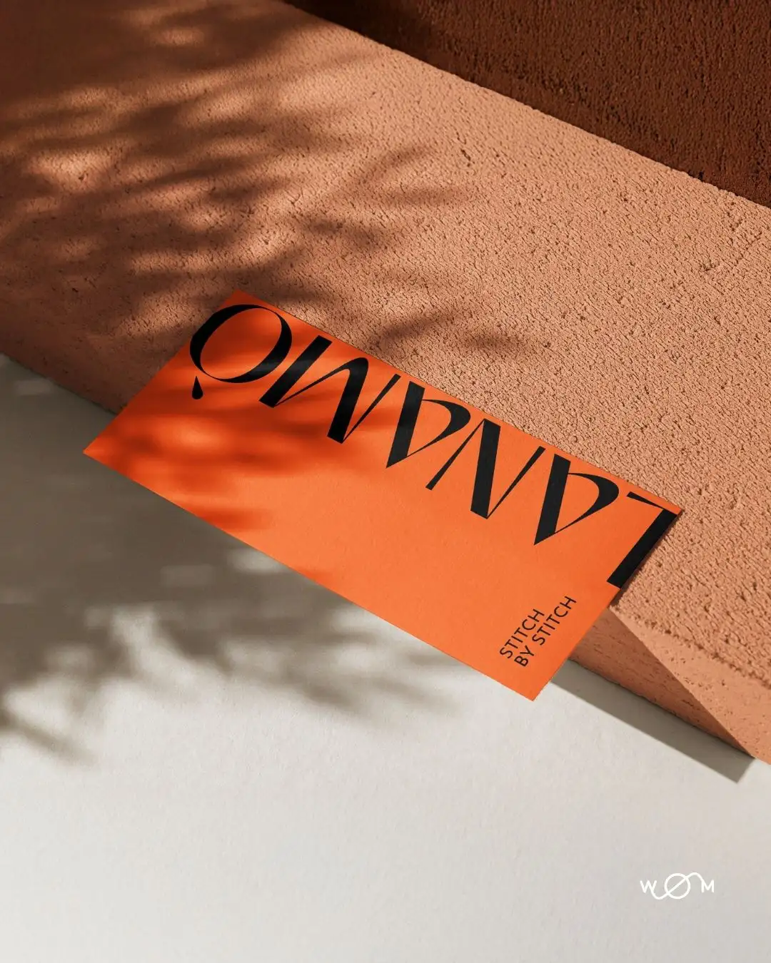
LANAMÒ
The Crystal Chunky Bag
overview
Deliverables:-Project naming
-Product naming and tagline
-Visual direction
-Copywriting for digital and print presentation
-Conceptual positioning aligned with yarn culture and material research
-SEO strategy linked to search interest around chunky bags, collectible glass, and textile-object crossovers
CONTEXT
A textile manufacturer with a long-standing presence in yarn production commissioned WOM to develop a concept object to be offered as a high-end gift to its top clients. The brief was specific: create a piece that speaks to the company’s textile heritage without becoming a commercial product. The goal was not to promote, but to translate material identity into form, with clarity, precision, and long-term symbolic value.
CONCEPT
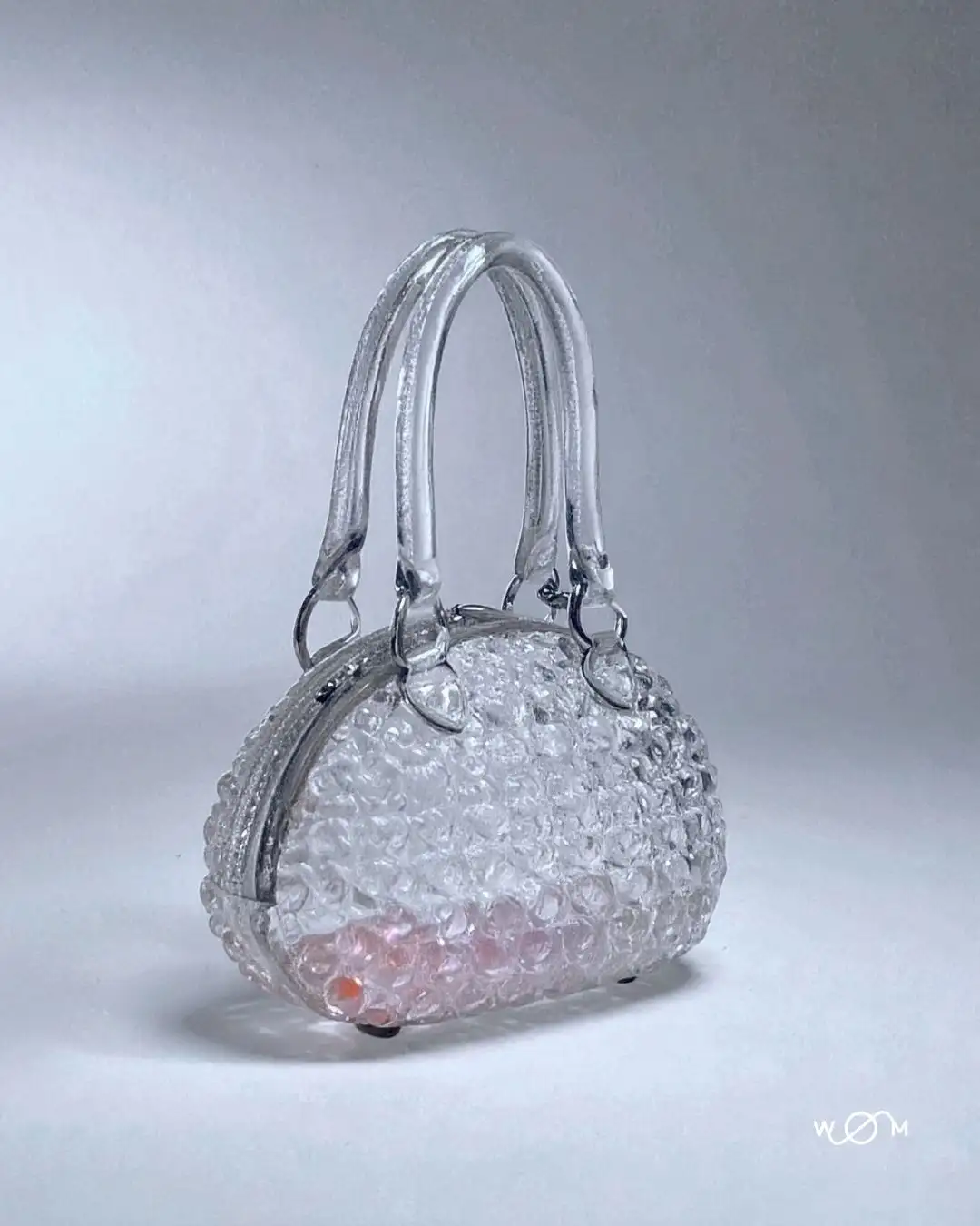
The idea took shape from a contradiction: a chunky knit bag made of glass.
We proposed a material contradiction: the form draws from the visual language of oversized knitwear, but subverts expectations through weight, rigidity, and transparency. The bag is designed to hold a single skein of yarn, bridging the functional logic of a tool with the symbolic presence of an object.
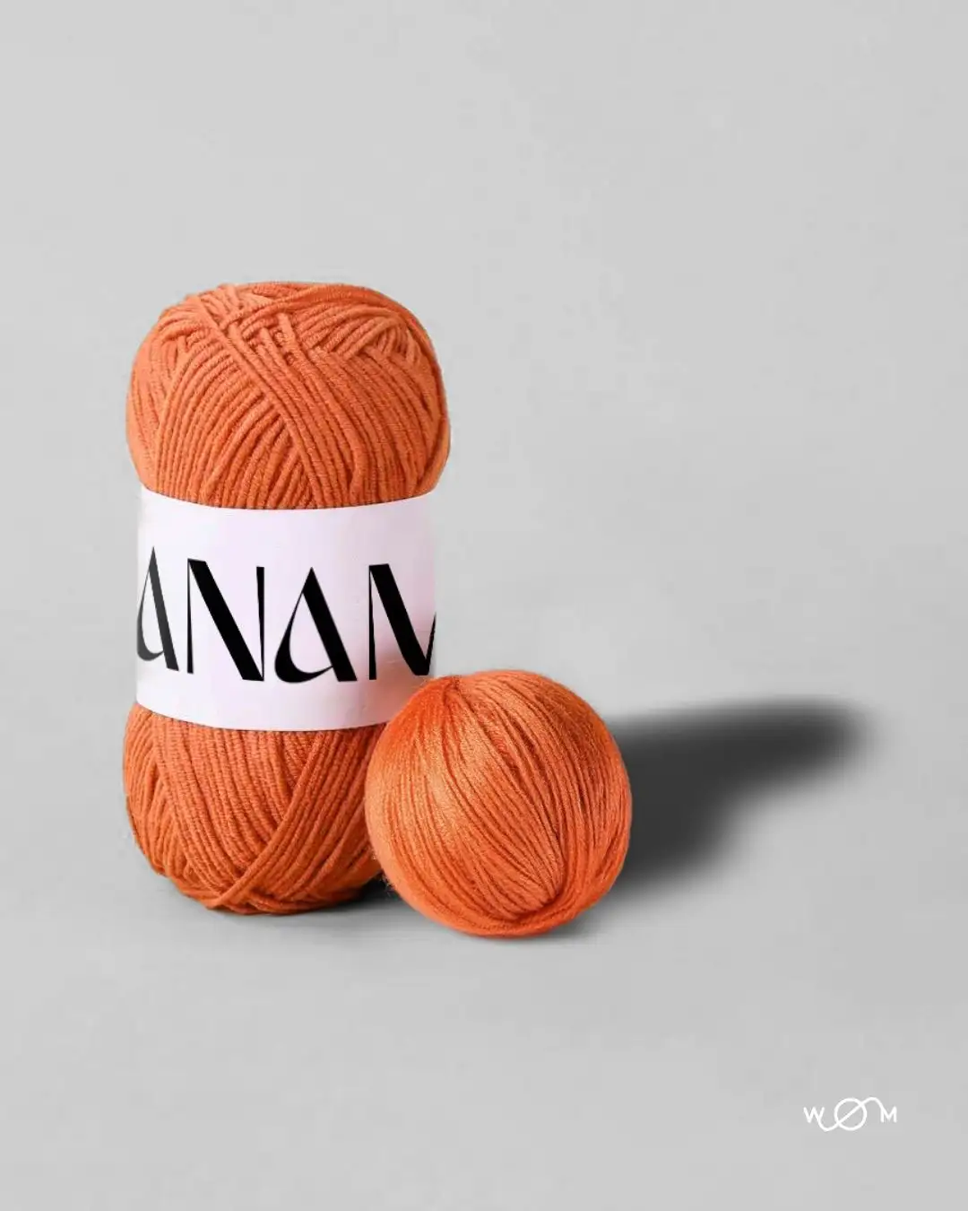
The name LANAMÒ was developed to give context and identity to the edition. A non-brand brand, structured to host limited-run collectible objects tied to yarn culture, material experimentation, and design curation. The project aligns with growing interest in fiber-based objects, sculptural accessories, and high-concept product storytelling.
DIRECTION
The design direction focused on material translation, from fiber to glass, from softness to mass. Our role was to define a visual and verbal system that could communicate the object’s nature with accuracy, avoiding excess.
We avoided lifestyle aesthetics or styled environments. The photographic art direction was developed to highlight the object’s surface tension, volume, and weight. Shot in isolation, the bag was presented as a functional sculpture and not a fashion piece, consistent with trends in collectible design and fiber-based object art.
Text was approached as an extension of form: concise, unembellished, structured. We treated copywriting and layout as part of a broader communication framework for product identity, aligning with the expectations of buyers, editors, and design professionals.
By removing distraction, the object became legible across multiple audiences: as a conceptual artifact for textile insiders, as a limited-edition collectible, and as a brand asset capable of conveying positioning through design.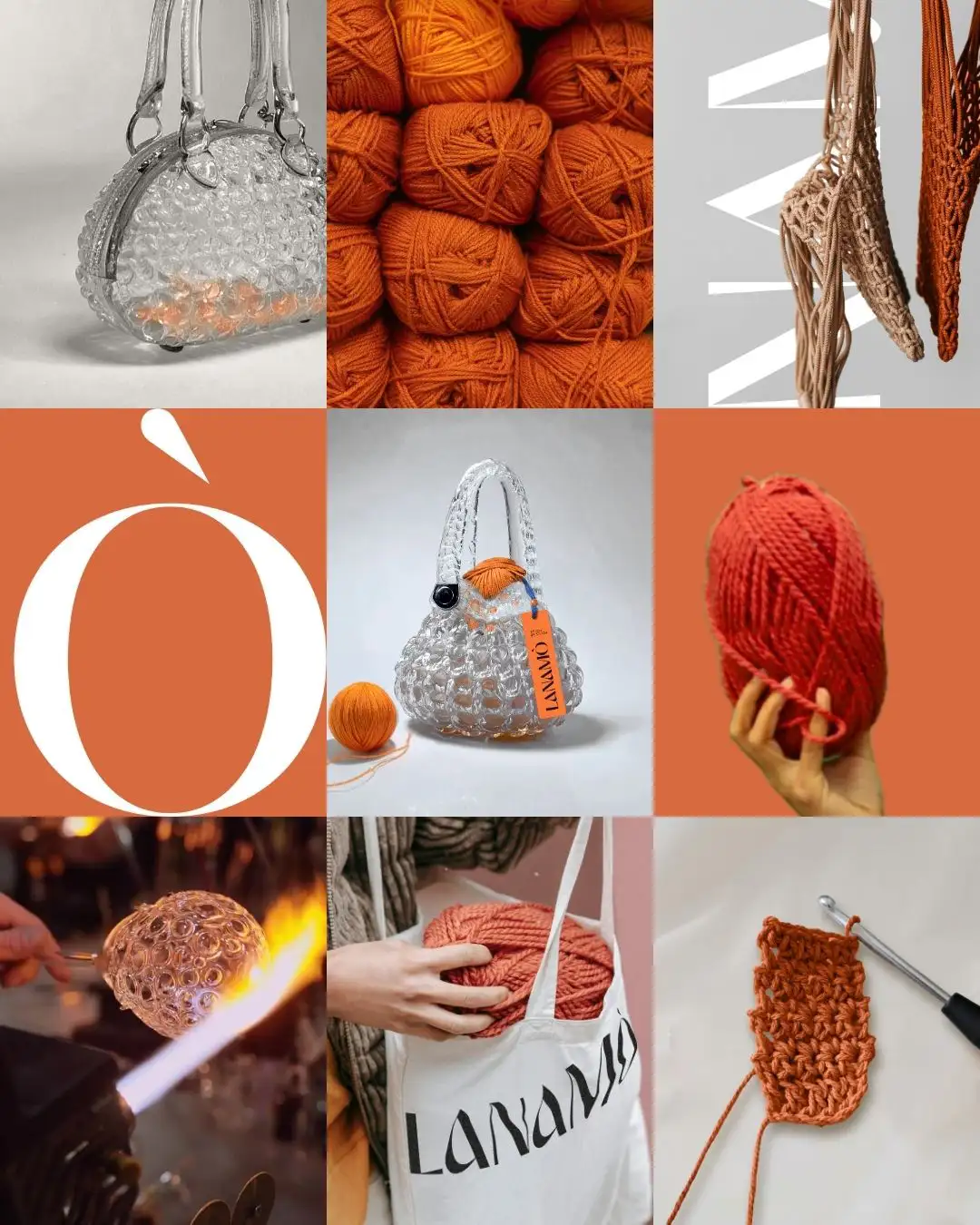

A textile manufacturer with a long-standing presence in yarn production commissioned WOM to develop a concept object to be offered as a high-end gift to its top clients. The brief was specific: create a piece that speaks to the company’s textile heritage without becoming a commercial product. The goal was not to promote, but to translate material identity into form, with clarity, precision, and long-term symbolic value.
CONCEPT
The idea took shape from a contradiction: a chunky knit bag made of glass.
We proposed a material contradiction: the form draws from the visual language of oversized knitwear, but subverts expectations through weight, rigidity, and transparency. The bag is designed to hold a single skein of yarn, bridging the functional logic of a tool with the symbolic presence of an object.
The name LANAMÒ was developed to give context and identity to the edition. A non-brand brand, structured to host limited-run collectible objects tied to yarn culture, material experimentation, and design curation. The project aligns with growing interest in fiber-based objects, sculptural accessories, and high-concept product storytelling.
DIRECTION
The design direction focused on material translation, from fiber to glass, from softness to mass. Our role was to define a visual and verbal system that could communicate the object’s nature with accuracy, avoiding excess.
We avoided lifestyle aesthetics or styled environments. The photographic art direction was developed to highlight the object’s surface tension, volume, and weight. Shot in isolation, the bag was presented as a functional sculpture and not a fashion piece, consistent with trends in collectible design and fiber-based object art.
Text was approached as an extension of form: concise, unembellished, structured. We treated copywriting and layout as part of a broader communication framework for product identity, aligning with the expectations of buyers, editors, and design professionals.
By removing distraction, the object became legible across multiple audiences: as a conceptual artifact for textile insiders, as a limited-edition collectible, and as a brand asset capable of conveying positioning through design.